The Sunday Times and British Climate
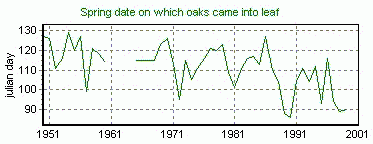
Spring Leaves The original source of the `Leaf emergence'
Graph is the web site, "Indicators of Climate Change in the UK"
(ICCUK) which is part of Department of the
Environment, Transport, and the Regions (DERT)
at http://www.nbu.ac.uk/iccuk/.
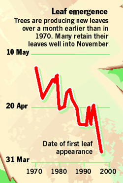
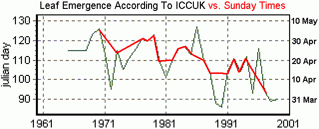
By contrast, the Sunday Times `Leaf emergence' graphic only covers the period from 1970 to 1997, with tic marks from 1970 to 2000 in 10 year intervals. At first the Y-axis appears to be strange having only three tic marks at the 31 March, 20 April and 10 May; however, these are actually the Julian days 90, 110 and 130, uncorrected for leap years. This is really the same scale used in the ICCUK graph. As the Sunday Times graph begins at 1970, the pre-1960 segment of data on the ICCUK graphic was discarded and the Sunday Times graph superimposed over the post-1964 portion.
The resulting composite (Fig.4 above) shows that in 17 out of the 28 years for which the two graphs overlap, the Julian date values are identical. The 11 Julian date values which were altered were those which would not support anthropogenic global warming. The resulting `Leaf emergence' graphic, which was published by the Sunday Times, is attempting to create the false impression that leaves in England are emerging earlier each year in response to global warming. In addition to misrepresenting the middle years, they have also been selective about their start and end dates in order to extract maximum effect for their warming claims. 1989 and 1990 in particular stand out as years where the Sunday Times merely `skipped over' them, hiding from the reader the fact that those two years, over a decade ago, were the warmest on the basis of leaf emergence. Also notable about the ICCUK graph
is that, for the period covered by the Sunday Times graph; the latest
emergence occurred in 1985 during a supposedly `warm' decade, a fact which the Sunday
Times quickly hid by the same dubious `skip-over' technique. The one thing
which is very clear is that Leaf Emergence is part of a long term cyclical
process for which we have a very limited amount of data.
Aprés
Ski
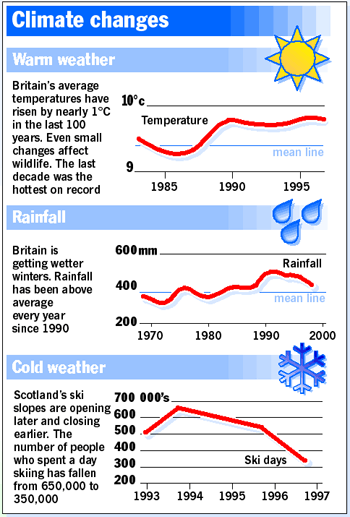
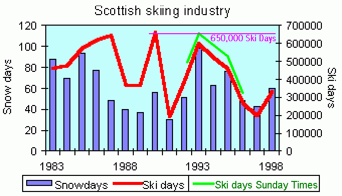
The Sunday Times `Cold weather' graph plotted the number of `Ski Days' in Scotland from 1993 to 1996. A Ski Day was defined by them as the number people-days spent skiing in Scotland in a given season. The real source of the `Cold weather' graph was also found on the ICCUK web site at http://www.nbu.ac.uk/iccuk/indicators/15.htm. A second copy of the same data was found on the web site of the Climate Research Unit (CRU) at http://www.cru.uea.ac.uk/, with the actual graph on the web page at http://www.cru.uea.ac.uk/cru/info/iccuk/ and the graph at http://www.cru.uea.ac.uk/cru/info/iccuk/skigraph.gif. The CRU credits their data to the ICCUK and links to that web site. As the two graphs were the same and the CRU graph was of better quality, it was used in this report. The CRU defined `Ski Days' as the seasonal number of ski-lift and tow passes sold in Scotland. The CRU graph also contained a bar graph for `Snow Days', which were defined as the number the number of days that snow was lying on the ground at Braemar in Scotland.
In Fig.5 the Sunday Times graph has been rescaled and superimposed over the GRU graph. With this done, a few things are immediately apparent: 1. The Sunday Times reported 50,000 more Ski Days for all dates than were reported by the ICCUK or CRU, with a maximum of 650,000 Ski Days. 2. The ICCUK and CRU graphs show that a maximum of 650,000 Ski Days did occur in 1990, immediately followed by a minimum of about 175,000 Ski Days in 1991. 3. Using the CRU and ICCUK scale, the Sunday Times graph only covers the date range from 1992 to 1996, thus avoiding revealing the very obvious minimum of 1991 No explanation is available
for why the Sunday Times reported 50,000 more Ski Days compared
to the ICCUK and the CRU. What is clear is that by ignoring the pre-1992
and post-1996 data, the Sunday Times created the impression that
the current conditions on the ski slopes of Scotland are rapidity deteriorating
and that the end of the Scottish Ski industry is near. What the ICCUK and
CRU data shows is that skiing conditions in Scotland are cyclical and may
already be recovering. Unfortunately, the ICCUK and CRU data ends in 1998
and no mention is made of the 1999, 2000, or 2001 seasons. If the news had
been bad for skiers (i.e. good for the global warming
industry), we would have immediately seen more current data on this
graph.
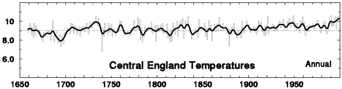
Warm Weather The Sunday Times `Warm weather' graph appears to be based mainly on the long-established `Central England Temperature' published by CRU, rather than for Britain as a whole. If so, it represents only a small fraction of the whole country. For the time period from 1983 to 1997, the Sunday Times graph has temperature values ranging from 9.2°C to 9.8°C. Dates after 1997 were omitted and the mean line of 9.4°C is obviously from a more complete data set. The key question is, if "1998 was the hottest year on record" why was it omitted from the record - and why was 1999 and 2000 not included as well? For the same time period, the CRU web site at http://www.cru.uea.ac.uk/cru/info/ukweather/fig1.gif shows a range from 9.2C to 10.3C with a historical mean of 9.0C for central England (Fig.6 below).
It is clear that the Sunday Times `Warm weather' graph must be a clumsy reconstruction of a selective portion of the above Central England Temperature graph from CRU as shown in Fig.6, not representative of Britain as a whole, but merely the most densely-populated and urbanised fraction of it. All urban areas exhibit long-term warming due to the well-known `Urban Heat-Island Effect' and Central England is home to tens of millions of people living in several large cities criss-crossed by numerous crowded motorways and other main roads. Had the Sunday Times
used data for all of Britain instead of just the most urbanised
part, the result would have shown a more neutral trend compared to central
England. Unfortunately a source for this data can't be located and no source
accreditation is made by the Sunday Times.
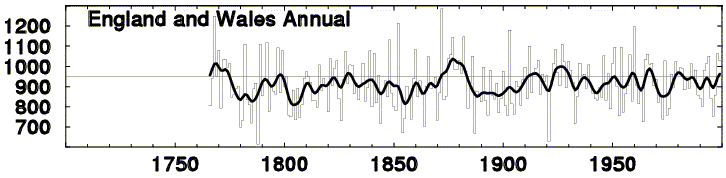
British Rainfall The final Sunday Times graphic was for `Rainfall' covering the years from 1968 to 2000 and contains rainfall values from approximately 320mm to 500mm, with a mean line of 380mm. For the same period for England and Wales, the CRU graphic at http://www.cru.uea.ac.uk/cru/info/ukweather/fig2.gif, (shown below) shows 840mm to 960mm with a 230 year mean of 950mm. The Sunday Times `Rainfall' graph is almost exactly half the expected value. If this graph were correct, England would be a much drier place then it currently is. For this reason the Sunday Times `Rainfall' graph is highly suspect. Again, no accreditation is to be found.
According to the CRU, rainfall in England and
Wales shows no overall increase at all in contrast with the Sunday Times
graphic which does show an increase. They even claim that "Rainfall
has been above average every year since 1990", a claim which is clearly
contradicted by the CRU graph in Fig.7 above, where rainfall is clearly
below the median line during most of the 1990s.
Conclusion It is highly disconcerting to see a journal with the long and distinguished history of the Sunday Times stooping to this level of journalism. The question which begs to be asked is: If the evidence for global warming is that compelling, why is it necessary for those who believe in global warming, to misrepresent data in this manner to support their cause? The data which was altered was not that
of the so-called skeptics, this was the data collected and published by
those who believe in global warming. By so crudely altering this data not
only does the Sunday Times do a disservice to itself, it also calls
into question the motives of ICCUK and CRU who have remained noticeablly
silent over this obvious misrepresentation of their data by their media
acolytes in the Sunday Times. |
Return to `Greenhouse Hall of Shame' page
Return to `Still Waiting for Greenhouse' main page