3rd May 2000
Comments
on
the Second Draft of
the IPCC Third Scientific Assessment Report
by Vincent Gray
![]()
![]() THE
SUMMARY FOR POLICYMAKERS
THE
SUMMARY FOR POLICYMAKERS ![]()
INTRODUCTION
I sent 97 pages of comments on the First Draft of the IPCC Third Assessment Report to the IPCC WG1. I have carefully gone through the Second Draft to find whether my comments were accepted. In many cases I have been agreeably surprised to find that they were. In some cases a comment that a particular section or paragraph was unnecessary did even lead to its removal. I feel I bear partial responsibility for some of the extensive rewriting.
My overall insistence of a better attention to numerical measures of accuracy and uncertainty has had a mixed reception. In some cases a real effort has been made to improve things, but the models, in particular, remain devoid of any semblance of numerical measures of uncertainty.
Several Chapters have been extensively rewritten. Some Chapters are almost new documents. It has sometimes been difficult to find whether comments made on the previous draft have been noted or not. It seems unfair to restrict further comments when there is so much new material.
This report on the Policymakers Summary will inevitably bring in issues from the various Chapters
GENERAL
On first reading I was tempted to assume that this summary was a distorted version of the Report itself. It certainly contains a full measure of distortions, exaggerations and ambiguities. However, after reading through the Report itself I consider that the Policymakers Summary does, in general, give a fair account of the Report itself, and the distortions, exaggerations and ambiguities are to be found throughout the Report. It is only fair to say also, that the Report also contains some excellent scientific information, which amplifies, but in some cases conflicts with that in the Policymakers Summary. It is made difficult of access by the refusal of the IPCC to provide an index.
The Policymakers Summary was evidently
hastily written, as it has several typographical and grammatical errors.
It has to be approved by a "line-by-line" procedure at a future
meeting, so there is a possibility of amendment. The rest of the Report
could also be amended, but it seems unlikely that "government"
comments will make much difference.
DETAILED COMMENTS
PAGE 1.
Title. I commented on the First Draft that the Title "Climate Change" should be replaced by "Climate Science", since the inclusion of the word :"Change" in the Title is unnecessary
This seems to have produced the following footnote on the first page which I have found surprising
"Climate Change in IPCC Working Group 1 usage refers to any change in climate over time whether due to natural variability or as a result of human activity. This differs from the usage in the Framework Convention on Climate Change where climate change refers to a change of climate which is attributed directly or indirectly to human activity that alters the composition of the global atmosphere and which is in addition to natural climate variability observed over comparable time periods"
So, there we have it. Our governments have signed a treaty on our behalf which asserts that all changes in the climate are caused by humans. Without us, the climate would be unchangeable, subject only to "natural variability". It can vary but it does not change. What nonsense!
Then, the IPCC. which has a more liberal approach, one which might even be consistent with actual facts, is prepared to use the term "climate change" to "refer" to any change in the climate. But they still persist in regarding any "change" in the climate that is not attributed to humans as "natural variability". In other words, they also refuse to admit that climate, without humans, can really change, but can only vary.
This fallacy pervades the whole Report. Chapter 12 is titled "Detection of Climate Change " I commented that this title is ridiculous since every single climate observation detects climate change. But they ignore me, because they adopt the dogma that climate change is caused, exclusively, by humans.
They divide "natural variability" into "natural external variability", which appears to include identifiable eternal influences such as the sun, volcanoes, El Niño and so forth, and "natural internal variability" not attributable to external factors. One of their chief weapons of detection is the simulation of natural internal variability by models, trying to show that real life natural internal variability is different or greater than the modelled variety.
Changes that are observed cannot be proper changes, they have got to be variable. Changes are classified as diurnal, annual, decadal or multidecadal, The idea that there might be some actual natural real climate change has to be firmly suppressed.
Line 12. "Is the Climate Changing?" What a stupid question! Everybody knows that it is.
Line 22 "The current estimate is that the global average surface air temperature over both land and oceans has increased by between 0.4 and 0.8°C since 1860"
Figure 1 is shown below. It will be seen that the rise in temperature from 1860 to 2000 is 0.71°C. Figure 2.8 from Chapter 2 is by its side. This shows two different methods of calculating the mean, together with two standard errors about the curve. One curve appears to show that the 1860-2000 rise is 6.9°C+4.2, -1.3, and the other is 8.1°C+3.1, -2.4.
Of course, the temperature rise from 1860 to 2000 can be assessed in several ways. Do you take the difference between the actual measurements at each end? That is unfair, as one or other might be "exceptional". Do you take the average of the first five and take it away from the average of the last five? This is the method used for the maps in Figures 2.9 and 2.10. Do you do a linear regression? Table 2.1 (Chapter 2) does this and gives 0.044 for the global linear trend, 1861-1999, which can be "cautiously interpreted as an equivalent linear warming of 0.61°C over the 139 year period, with a 95% confidence level uncertainty of ±0.21°C. From 1901 an equivalent warming of 0.65°C has occurred, with an uncertainty of ±0.20°C. These estimates of equivalent linear trend, and uncertainty in the trend, do not allow for uncertainties in the annual values though this has a small effect(see below)"
A revised figure, using a new method is promised.
There are further mysteries in Chapter 2. Page 14, line 28 which says " Other uncertainties should be added e.g. those due to urbanisation (less than 0.05°C in the combined land and ocean trend) and those due to changes in thermometer screens (poorly known but could be bigger than 0.05°C, Parker 1994) but the latter have yet to be adequately researched".
I had always thought that "urbanisation" errors should be subtracted not added.
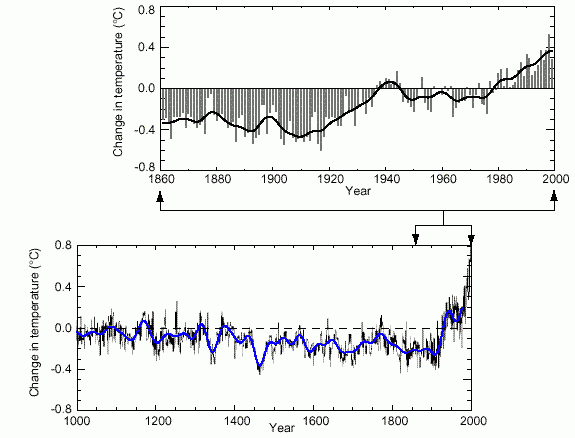
Figure 1.
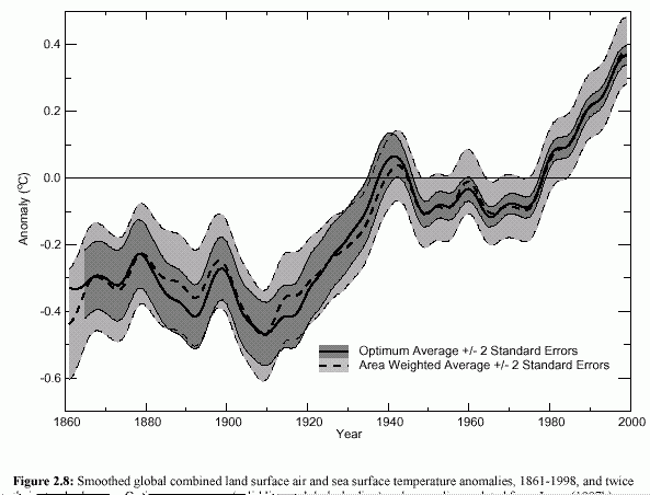
Figure 2.8
I have persistently argued that "urbanisation" errors, which are not necessarily confined to urban sites, are a probable significant contributory cause of recently observed surface warming, and that this possibility has been insufficiently researched.
If we accept the statement in line 23 that the temperature rise since 1860 is 0.6°C±0.2°C, it means that there is a 1 in 20 chance that the surface warming of the past century was 0.4°C or below, half of which took place before 1940. Where, amongst the "impacts" is this real possibility being considered, and what "projections" allow for it? It is also, surely, compatible with "natural variability".
Line 26 " Rate and duration of warming appears to have been" How judged?
Line 27 " the 1990s was likely the warmest" unlikely if you consider satellites and weather balloons
Line 30 "Minimum temperatures have been increasing at about twice the rate of maximum temperatures". Clear evidence of local heating
Line 35 "satellite
record
now more consistent" The usual vague subjective judgement.
This statement seems to be a relic of the First Draft and the National
Academy of Science Report, which used the excuse of the fact that both
satellite and surface measurements detected the 1998 El Niño event,
to argue that, therefore they were "more consistent" with one
another. It is obvious from subsequent MSU readings that if the effects
of that event, and of the Mount Pinatubo event in 1991 were removed from
both records, there would be a complete disagreement between them. As can
be inferred from the recent MSU record (below),.
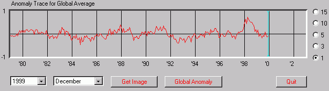
The MSU and balloon records show no evidence whatsoever of recent warming if "natural variability" is removed. It is often stated that weather balloons agree with the surface record before 1979, but not after it. There is rather a confusing Figure (2.12 in Chapter 2, below) which plots surface, MSU and balloon readings on the
MSU (satellite) troposphere temperature anomalies since 1979
same graph, and provides a second graph "surface minus Troposphere" which appears to show that the surface measurements have always been higher than the troposphere, apart from a period in the early 1980s.
Personally, I am unclear what is supposed to be shown by this graph. It only uses one balloon series, The text (pages 17 and 18 in Chapter 2) is largely devoted to casting doubt on the reliability of weather balloons, particularly the early ones, and there is no mention of the alleged agreement of weather balloons with the surface before 1979. In the next paragraph on Page 18 satellite measurements are given short shrift, giving the impression that these measurements are also unreliable.
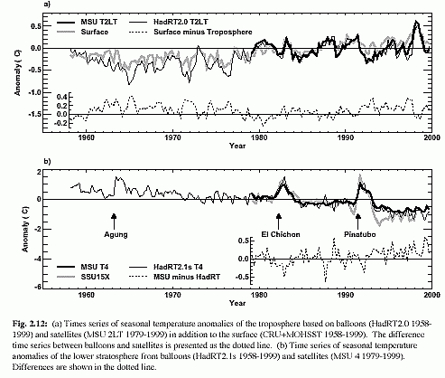
Figure 2.12(a). Comparison of MSU, weather
balloon and surface temperature anomalies
Line 37 "corrections especially satellite-derived data" They do not say that the satellite data are relatively unaffected by the corrections, and they do not mention the need to correct surface data as well
Line 40 " Satellite and balloon measurements both show that temperatures above the surface have been increasing" Untrue, if the effects of "natural" events such as Mt Pinatubo and El Niño are removed..
Line 41 " Corrected trends are now more consistent" How do you know when something is "consistent" or "more consistent"?
Line 43 " unexplained difference ..may arise from real differences between surface and upper air trends". Yes, the "greenhouse effect" cannot be detected from the troposphere.
Line 45 "Precipitation amounts continue to increase in many regions". Since when? "Decadal", "multidecadal", a trend? Blame everything on carbon dioxide. however tenuous.
Line 48 "conditions have become drier" More rain means floods, less rain means drought. Never beneficial.
PAGE 2
Line 1 "Snow cover.. sea ice continued to decrease" ? Decadal. mulltidecadal, trend? Human-induced?
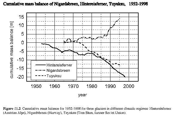
Line 6 "There has been a large retreat of alpine continental glaciers, consistent with warmer temperatures". Since when?. Take a look at the accompanying Figure 11.2 which shows one glacier, at least, which is expanding.
Line 8 "40% decline in Arctic" Arctic what?
Line 9 "Limited sampling .may not reflect broad areas of the Arctic" An admission. to be noted
Line 14. "Tide-gauge data show a rise of global sea-level during the 20th Century by between 10 to 20 centimeters"
I made persistent comments throughout the last Draft, that climate data should state uncertainties in the form of 95% confidence limits. This is a convention accepted throughout the scientific community and adopted throughout Chapter 2.. It implies that there is a 1 in 20 chance that the results might fall outside these limits. It is obtained from two standard deviations about the assumed normal distribution curve.
I was present at the recent meeting of the TAR drafting committees in Auckland, and I was surprised to find, amongst a group of "sea-level" experts, that my request had really worried them. The new draft of Chapter 11 "Changes in Sea Level" is the only one that has taken special note of my request , in that they have inserted a "Box" (Page 6) on accuracy. However, the idea of 95% confidence limits is obviously unacceptable because this would give the public an unacceptable impression of true sea-level variability.
The quoted figure, therefore, represents "confidence limits" of only one standard deviation; so there is one chance in three that the actual sea-level rise of the past century was as low, or below 10 centimetres, and one chance in 200 that it was at, or below, zero. That is pretty long odds, but what if they have underestimated their standard deviation? What if it was 7.5 instead of 5? That would mean a 1 in 20 chance that it was zero or below. BUT take a look at Figure 11.8. suppressed from the previous draft!
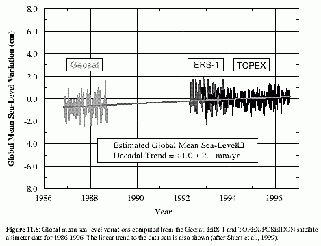
The TOPEX satellites have found that the sea-level rise since 1986 has been at a rate of +1.0±2.1 mm/yr. This means that there is a 2 in 5 chance that the sea-level rise is zero, or is falling.. Now that wouldnt look good in the "Summary for Policymakers", would it?
Line 17 "Based on a few.. records, it appears that etc." Drag in the most unreliable data,
Line 21 "There have been changes are observed in large-scale etc. etc." It would be amazing if there were no changes in these patterns.
Line 32 "tropical
and extra-tropical storms, such as hurricanes
with no clear long-term trends".
Their own Figure 2.35 shows evidence to the contrary, as follows:
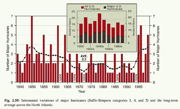
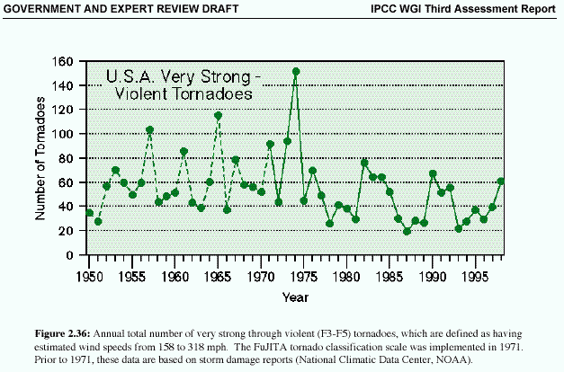
Line 33. "There is no evidence for systematic changes in severe local storms, such as tornadoes." It depends what is meant by "systematic", but take a look at above, right (Figure 2.36). If it were upwards they would have no difficulty in finding a trend..
.Line 36 "The collective picture from many observed trends is that of a warming world". But there is no evidence that this is "anthropogenic"
PAGE 3
Line 13 "Observations indicate" This gives the impression that there are actual observations of "uptake of CO2 by terrestrial ecosystems", whereas the figures that are quoted in the Report are very inaccurate calculations obtained by theoretical deductions from changes in oxygen concentrations and isotope frequencies.
Line 17 "Climate variability influences CO2 uptake by land and ocean" What a surprise!.
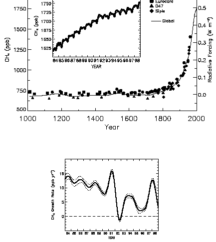
Line 20 "Atmospheric methane (CH4) concentrations have increased the rate has become slower" They conceal the fact that the rate of increase is fast approaching zero (Figure 4.1.)
Line 35 " Most anthropogenic aerosols etc." The last draft had the following statement (Chapter 5 Page 50, lines 8,9)
"The net forcing of the climate over the last 100 years (and since pre-industrial times) may be close to zero or even negative".
This has now been watered down to the following (Page 40 lines 11, 12)
"The largest values of negative forcing due to the warm-cloud effect may approach or exceed the positive forcing due to long-lived greenhouse gases. On the other hand "
Myself, I doubt very much whether aerosols can be very important. If they were, there would be a definite difference in temperature change between the Northern and Southern Hemispheres. This issue is evaded throughout this Report because the IPCC want to make use of aerosols to help out their models.
Line 54 . The sun. Theoretical reasons for the influence of the sun are just as plausible as those justifying the greenhouse effect..
PAGE 4
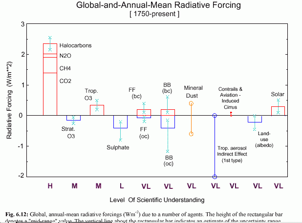
Line 5 "Our best estimate of the net radiative forcing over the Industrial Era is positive (i.e. contributing to surface warming)." Surprisingly lukewarm. What is not mentioned is the enormous uncertainty that should be attached to this estimate. They are not even prepared to indicate its approximate value, but cover it up by "Levels of Scientific Understanding" Incidentally, Figure 2 in the Summary for Policymakers omits two forcing factors from the Figure 6.7 in Chapter 6 shown here.
Line 15 "The only tool that enables quantitative simulation of the climate system .is the numerical climate model".
If you feed fixed numbers and precise equations into a mathematical model you get a quantitative result, but without the uncertainties that need to be attached to each number and each equation the value of the quantitative result is unknown. These uncertainties are certainly so great that it is quite possible to simulate almost any climate sequence by a suitable choice of parameters and equations, but without a quantitative measure of the uncertainties the value of any simulation cannot be assessed.
This dilemma goes to the very heart of the IPCC system. They are unable to tell whether models are really successful or not, because they are unable to provide quantitative measures of success. They are therefore reduced to purely qualitative, subjective, and undoubtedly prejudiced opinions about how the models are "consistent", "more consistent", "robust" "plausible", "successful" and so forth. They are continually expressing their "confidence" in the models. They talk about "reducing the uncertainties" when they have no idea how great the uncertainties are, or how much they might have reduced them.
They use the :"range" of model results as a substitute for a measure of uncertainty. They use "sensitivity analysis" as a substitute for statistical analysis. They use advanced statistical procedures to analyse the climate data, and carry out "pattern analysis" and "fingerprinting" exercises, but using fixed model outputs, so rendering the exercises useless.
One of my early successes was the comment on the draft of the Second Assessment Report, that no model has ever been "validated" in the sense of being such a plausible representation of an extended climate sequence that it can be used with confidence for future projection. Therefore the Chapter Heading "Validation of Models" should be changed.
They certainly took this comment to heart. They changed the word "validation" to "evaluation" in that chapter no less than 50 times! It still crops up occasionally but I have usually been successful in stamping it out.by my comments.
Another comment, on the first draft of the TAR, was that there should be a detailed description of the procedure to be followed in order to "evaluate" a model, involving a quantitative statistical treatment of uncertainties. The comment fell on deaf ears.
They refuse to regard one model as better or worse than another. They have no way of deciding. Whats more it is politically difficult to tell one model team that their model is inferior to another one. This situation at least allows them to select one group of models to simulate one climate sequence, a different set to simulate another climate sequence, and yet another to "project" future climates.
"Confidence" in the models can be assessed by the fact that, despite repeated attempts to point it out, no less than 47 of the 91 models listed in Table 9.1 assume that carbon dioxide in the atmosphere is increasing at the rate of 1% per annum. This is 2½ times the actual measured rate of increase for the past 33 years, and at least double any conceivable "equivalent carbon dioxide" increase. It is amazing that so many modellists have no intention of using plausible climate parameters in their models. How many other parameters are equally phoney?
Uncertainties were published in the Second Assessment Report for the components of carbon cycle models. My paper (Climate Research 1998, 10. 155-162) showed that when incorporated into an overall uncertainty for the model output the 95% confidence limits of that output were ± 120% or higher. The paper, or its conclusions, is not mentioned by the IPCC. The uncertainties that need to be attached to the "stabilisation scenarios" which extend to the year 2350 would defy the imagination.
Quantitative figures for model uncertainties are certainly difficult to obtain. But the political difficulties are much greater. If they were ever derived it would emerge that all models could equally predict any climate sequence to a uniformly low level of probability.
Line 41 "From the body of evidence since IPCC (1996) , we conclude that there has been a discernible human influence on global climate". This is the celebrated IPCC "doublespeak". There is no stated indication that increases in greenhouse gases are involved in the "discernible human influence", and if you get one of the scientists involved into a corner, that is what he/she will say. The general public, the politicians and the eco-green lobby are in no doubt that the statement does mean that greenhouse gases are involved in "discernible human influence", otherwise why should they want to control them. It is greatly to the discredit of the IPCC that they positively encourage the alternative interpretation in their public pronouncements.
Line 53 "suggest that the observed warming over the past 100 years is exceptional and unlikely to be solely natural in origin" At least they "suggest" that part of it is "natural in origin", something few of the models allow for. However, it is only a "suggestion", hardly a fact.
PAGE 5
Line 2. "There are new model estimates of internal variability" Since "internal variability" does not include the effects of the sun, volcanoes, El Niño and so on it is hardly surprising that "the observed change in global surface temperature is unlikely to be explained by internal variability alone".
Line 8 "natural forcing effects produce a cooling over the last two decades" I am baffled. I cannot find the justification in the text. Do they include aerosols?
Line 13 " recent changes in global mean surface temperature cannot readily be explained by natural causes" So they are "anthropogenic", probably local heating effects .
Line 15 "consistent with" does not mean a cause and effect relationship.
Line 20 "This work suggests that anthropogenic greenhouse gases are a substantial contributor to the observed warming, especially over the past 30 years" This statement is evidently the result of political pressure to beef up the "discernible human influence" of the previous Report. It is rather strange.
Firstly, is it a misprint? In the Technical Report page 29, line 20 is stated "This work suggests that anthropogenic greenhouse gases are a substantial contributor to the observed warming of the past 50 years". Then in Chapter 12 (Detection and Attribution etc.) there is the same statement, involving 50 years, on Page 5 line 50 and page 29 line 4., so maybe they mean 50 years. It is a bit surprising, as for the first half of those 50 years (1950 to 1975) there was an observed global cooling. Then, there has also been an observed cooling since 1998.
Secondly, it is only a "suggestion"
Thirdly, "substantial contribution, especially over the last 50 years" Surely they do not believe that anthropogenic greenhouse gases made a "substantial" contribution to the observed warming even before the last 50 years: for example from 1910 to 1945? Since there was such a small increase in greenhouse gases over this period the temperature rise must surely have been "substantially" due to other factors, such as "recovery from the little ice age", urbanisation from the growth of cities around the measurement stations, and two world wars which replaced old stations with better ones with bigger buildings and better heating.
Line 28 Scenarios.
The recently developed SRES scenarios are the subject of a separate IPCC "Special Report on Emissions Scenarios" which is now complete but not yet published. It is not specifically treated in this Report and the summaries in Figure 4 of the "Policymakers Summary" and elsewhere are highly condensed.. Chapter 13 on "Climate Scenario Development" is pretty useless as it does not mention the SRES set of scenarios at all.
With some difficulty I obtained a copy of the Second Order Draft, and submitted comments. I have not yet found out what happened to the comments, but it is evident from this report that my comments on the lack of correspondence between the scenario assumptions and the current climate parameters may have been remedied. On the other hand, my main comments about the implausibility of most of the "Marker" scenarios have been ignored.
The Special Report on Emissions Scenarios is the most intensely political of all the IPCC documents, as it provides the basis for future "projections" and all the on-going "impact" studies which are supposed to tell the world what we may expect in the future.
The IPCC is very insistent that scenarios are "projections" and not "forecasts", or "predictions". As with the "discernible influence" ambiguity they leave the assumption that they are forecasts to the politicians who implement the conclusions of this Report..
"Projecting" into the future is not a scientific discipline, even when it carried out by self-styled scientists Economists, who are used to being involved in "projections" are unlikely to succeed for more than 20 years ahead. Yet the climate scientists, at the behest of the IPCC, have no qualms in projecting 100 years ahead and even further. The potential for success can be gauged by just sitting down and considering whether you could have made a plausible projection of todays world if you had lived 100 years ago. Yet the IPCC is prepared to go even further for its "stabilisation scenarios" which extend to 2350..
Previous IPCC scenarios, have been based on a very limited number of supposedly plausible projections in climate parameters, population increase, economic progress, and energy usage. The extent to which these scenarios corresponded with reality for the first eight years of their existent was examined in my paper ("The IPCC future projections, are they plausible? .Climate Change 1998 10, 155-162). I showed that every one of the IS92 scenarios of the Second Assessment Report exaggerated one or more of the measured parameters. IS92a, which was regarded as the successor to the "Business as Usual" Scenario of the First Report, was shown to be completely unacceptable for future projection over only eight years. Yet it is continually referred to with approbation in the Third Assessment Report, and used as the basis for many future projections, where the workers have not yet had time to take in the new set of scenarios. Naturally, my paper which shows its inadequacy, is not mentioned.
The exercise on scenarios that has just been completed by the IPCC was elaborate. More than 500 scientists were involved. Scenarios were invited from a wide variety of sources. The eventual number received and displayed on their website was 416.. The range of "projections" of these scenarios was, as might be expected, huge. Global carbon dioxide emissions in the year 2100 ranged from 10 times the current amount to a negative amount (?).
The projections were boiled down into 35 SRES scenarios, in four "Marker" Scenarios groups A1, A2, B1, B2. which are considered to be "indicative".
All these scenarios are highly plausible if you have enough imagination, but, like the previous set, there is no provision to check whether they correspond with reality as the years roll by, and no means of correcting them in line with the behaviour of the real world. The original figures for 1990-95 were, as might be expected, all exaggerated, and although these seem to have been corrected, all of the scenarios have failed to cope with the fact that emissions fell in 1997 and 1998.
The IPCC insist that there can be no preferences as between the different scenarios. All are equally plausible. As will be seen below, some are more "equally plausible" than others.
Although great play has been made of adopting scientific procedures for selecting the "Marker" Scenarios" there can be no doubt that the real reasons for choice were political.
The lowest projection for temperature, a rise of 1°C by 2100, would have been chosen as the largest rise that could plausibly be compatible with current trends, and the minimum which would keep on board the doubters and the wimps who are not sure that there is a greenhouse effect. The upper limit, 5°C is decided because it the lowest that could still, with a little persuasion, be considered plausible, but satisfy the lobbyists who demand evidence that man is ruining the planet. It is obvious that they could not have chosen an "indicative" scenario which gave a projection of 0°C for the year 2100, although some were submitted, and they were entirely plausible. Similarly, it would have been impossible to provide a "projection" of 10°C, however plausible. It would drive the environmentalists crazy with worry.
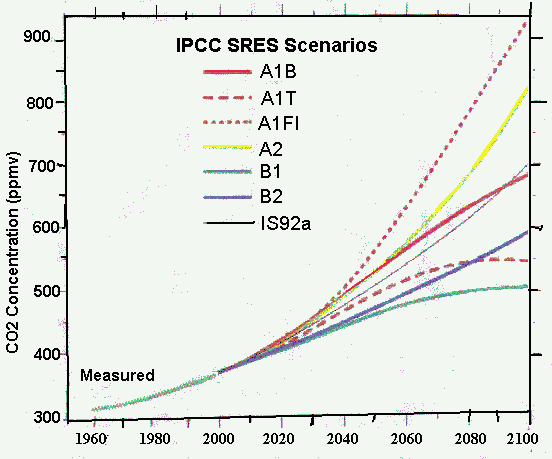
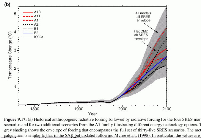
The resulting set of projections, which include all 35 SRES scenarios are shown as the Left Hand graph below.. It is a rare example of the scenario projections being included on the same graph as the actual measurements, and it shows how unlikely the whole exercise is. The sharp rise in temperature "projected" for all the SRES scenarios, starting in the year 2000. will turn out to be as false as those that were projected for the IS92a scenarios. The IPCC has shown a reluctance to print the scenarios in association with other measured climate parameters, so let us see what happens if it is dome.
Figure 9.17(b)
The right hand figure above is for carbon
dioxide. Carbon dioxide concentration in the atmosphere has increased at
the linear rate of 0.4% a year for 33 years, and it would seem extremely
unlikely that it could take a sudden turn upwards, as envisaged by the
higher scenarios.. Let us look at emissions and methane.
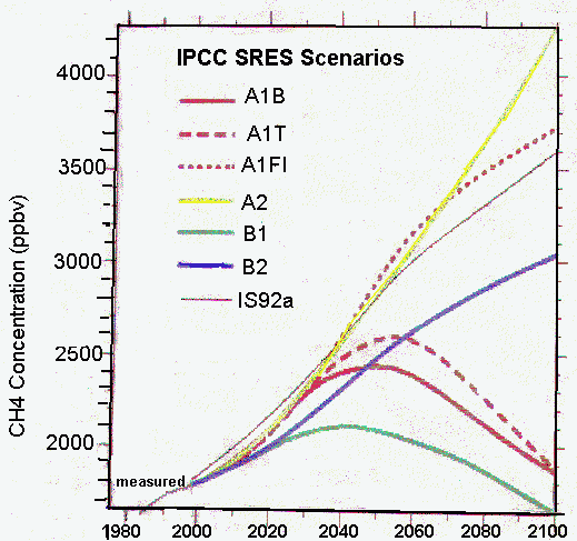
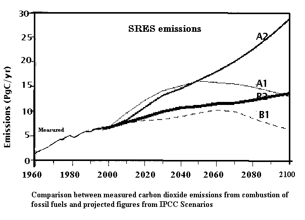
The above graphs show carbon emissions
(bottom) and atmospheric methane concentrations (top). It is evident from
both of these that the A scenarios are highly unlikely. Who could believe
that there will be a sudden increase in emissions, starting next year?
The implausibility of the A scenarios is especially evident with methane,
which is currently approaching a constant value in the atmosphere, not
catered for by any scenario.
PAGES 5,6,7
These are mainly concerned with "projections" from the SRES scenarios. As I argue above, these scenarios, and therefore the "projections" are arbitrary, mainly decided by political considerations, and not from a genuine desire to display possible future change. Sensible projections would not attempt to make suggestions as far ahead as the year 2100, or if they did, would provide much greater ranges in the projections such as those originally received by the IPCC teams.
Page 6. Line 28.. "By the end of the next century, the range in projected temperatures due to differences in the SRES emission scenarios is similar to that due to the uncertainty in the models. Further uncertainties arise due to uncertainties in the radiative forcing, notably that due to anthropogenic aerosols" A touching confession!
That is just what I have been saying, and the first time there is a rough idea given of how large the uncertainties in the models are. Are they saying that the projected temperature range for the year 2100 should be doubled ; to between minus 1°C and plus 7°C?
Page 7 Line 24 "The range of global sea level rise from 1990 to 2100 due to increasing greenhouse gases of the SRES scenarios is estimated to be between 0.1 and 0.9 meters". All the other paragraphs talk about "projections", why not this one?.
Page 7. Line 29 A cry for more money.
Finally a quotation from Chapter 1. (Page 14, line 4) which has survived into the second draft, and might even appear in the final version.
"The fact that the global mean temperature has increased since the late nineteenth century and that other trends have been observed does not necessarily mean that we have identified an anthropogenic effect on the climate system. Climate has always varied on all time scales, so the observed changes may be natural."
![]()
THE TECHNICAL SUMMARY
OF THE THIRD ASSESSMENT REPORT OF THE IPCC
This Summary at least has identified authors.. It retains the defects already detailed in my comments on the Summary for Policymakers, but often in a more flagrant and extreme form.
It continues to promote the fallacy that climate change is exclusively due to humans, but without it, all we get is "natural variability". For example Page 4, Line 4 says
"Any human-induced changes in climate will be superposed on a background of natural climate variations"
On the next page is (Page 5, line 38) "Is the Earths climate changing? The answer is unequivocally "Yes"", Since "change" is exclusively caused by human influence, this is a statement that they are sure that humans are influencing the climate.
Yet two lines down (line 42) They say "observations that delineate how the climate has changed in the past". In other words, they are admitting that climate can change without humans.
It is further confused by (line 53) ""the current understanding of past changes in key climate variables"
They have things both ways.
They continue ( Page 4, lines 5-11) to make a distinction between "external natural variability" caused by volcanoes and the sun and "natural internal variability", which I learn, for the first time, includes the El Niño-Southern Oscillation Index.
They make great fuss (Page 27, Line 17) over their discovery that natural internal variability, as simulated by models, is less than the variability of the real climate, therefore the real climate must be influenced by humans. This argument is fallacious, as the real climate includes the sun and volcanoes. Also, they admit that there are inadequacies in model simulation of El Niño. Later, (line 44) they think that both "external" and "internal" are not enough.
The total absence of quantitative information on the uncertainties that need to be attached to model outputs is blatantly obvious throughout the Chapter. The authors appear to have been issued with a glossary of qualitative epithets which can be used to display "confidence" in models without ever giving any quantitative information on which that confidence might be based.
"consistent" is the most popular. Then there are "consistent picture", "best estimate", "remarkable consistency", "good agreement", "It is likely that", "a degree of consistency", "ample evidence", "indicate that", "significant", "about", "compelling evidence", "only slightly", "coincides with", "relate well", "broadly consistent with", "qualitatively consistent with", "strongly support", "better predict" (here, they are naughty; you are not supposed to say "predict", it has to be "project"), "varying quality" "improvements have been made" (on what?), "more firmly established", " about a factor of". "broad quantitative estimate" (oxymoron!), "substantial gains", "notable advances", "overall confidence", "ability to reproduce", "major improvements", "more realistically depict", "growing capabilities". And so on and so on.
The fact is they do not know, and are scared to find out, actual quantitative figures for the uncertainties that should be attached to the outputs of climate models. They unable to put a figure on all these qualitative expressions of confidence. They have no idea whether they are really "reducing the uncertainties" since they do not know what the uncertainties are, or how much they have been reduced.
The confusion over what actual change in surface temperature has taken place since 1860, which I detailed in my comments on "Summary for Policymakers" above, is compounded here, by their statement (Page 6, line 27) that 0.6±0.2°C is a "Best Estimate". Their Figure 2 continues to confuse the reader by showing an increase of 0.71°C.
They repeat the claim (page 7 line 6) that "temperature trends for the troposphere and near the surface are in good agreement" in the teeth of the evidence to the contrary, and follow it with excuses.
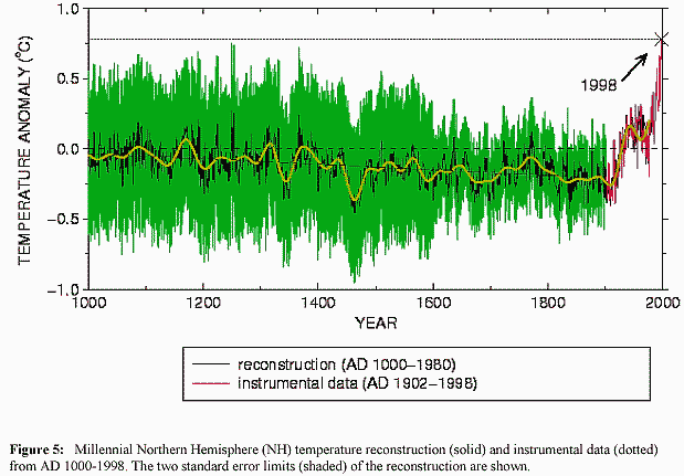
Page 7, line 22 "It is likely that the rate and duration of the warming of the 20th Century is larger than at any other time during the last 1000 years" is not confirmed by Figure 5 (below) which shows past proxy-measured temperatures, plus two standard error limits, and the fact that a single recent temperature measurement has reached the largest extent of those past limits, and then fallen within them. Many past proxy measurements are averages over longer periods than one year, and the deviation shown is, just, within the limits shown for the past measurements
Much is made of "recent" increases in precipitation in middle and high latitudes, and reductions in tropics and sub-tropics (Page 7, line 51), but there is no mention of the possibility that this might be "variable", or "naturally variable", or even (beshrew the thought) an example of "natural climate change". As with the SPM, they downgrade the evidence that hurricanes and tornadoes are decreasing.
Sea-level change has also suffered a degradation in accuracy definition from the text Chapter. The 33% confidence limits of 1.5±0.5 have become a "range" They give the wrong figure of "about 1.8mm/yr." on page 9, line 53. Naturally, there is no mention of the recent TOPEX measurements which give a different story.
They continue to fail to point out that the rate of change of methane concentration in the atmosphere is approaching zero, and they provide the figure of 8.4 ppbv/yr as the "Rate of concentration change" in Table 1., when the current rate is nearer 5ppbv/yr.
They quote changes in radiative forcing with ± confidence limits, but do not say whether this is one or two standard deviations. I bet it is only one. The limits in Figure 8 have to be increased substantially, anyway, to allow for the "Levels of Scientific Understanding".
They repeat the claim (Page 18, line 11) that models "provide quantitative estimates of future climate change", contrasting them with the inadequacy of "the use of extrapolation of past trends or statistical and other purely empirical techniques for projections" This last, is, or course, a fair description of the IPCC Emissions Scenarios, but the whole claim is specious because the "quantitative " results of climate models are useless without a knowledge of the extent of their uncertainties.
They continue to judge the carbon cycle (Page 22 line 11 ) decadally, so no trend can be distinguished ( Table 2).
I continue to be baffled by the claim (Page 27, line 44) that "net natural forcing (i.e. solar plus volcanic) has been negative over the past two decades" and find the attempt to illustrate this in Figure 14 incomprehensible.
Further description of the SRES Scenarios is most welcome. I discover that my comments on how the figures assumed for 1990 to 2000 did not coincide with actual reality have, apparently, been taken to heart. But, you have to laugh, they have not altered the subsequent ones which followed on, so there is a sudden jump in the year 2100 for all scenarios (Page 33, line 47). As a result, the scenarios will deviate upwards from the actual climate even earlier than expected.
![]()
Return to `Climate Change' Guest Papers
Return to "Still Waiting For Greenhouse" main page