Unfortunately
for the USGCRP, the two models show the areas of warming and cooling to be
occurring in widely different sections of the United States. The USGCRP's solution to this conundrum was to alter the
temperature color scale by eliminating yellow and green, and extending the
color orange into negative temperature ranges as low as -1.0°F, thereby
implying warming, when in fact the models were showing no temperature change
or cooling for some localities.
 |
When the "Draft" and
"Final" copies of the USGCRP graphs are animated, employing a
technique used elsewhere on this web site, the
amateurish nature of the deception becomes painfully obvious:
|
Not only
was the distorted temperature color scale used to obscure the next 100 years of
temperature models, it was also used to change the perception of the United State's
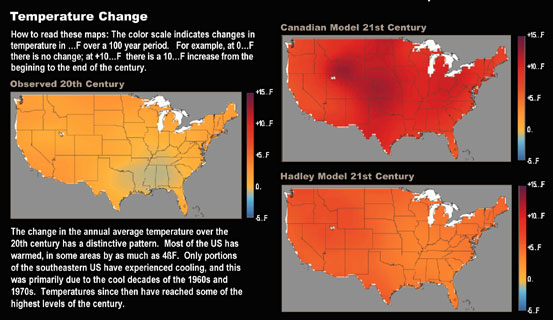
past climatic history. The page "Overview:
Looking at America's Climate" contains a graphic titled "Temperature
Change" (shown below), which attempts to minimize the significant cooling which occurred in
the Southeastern United
States during the 20th
Century. This is achieved by coloring even the zero or `no change' temperatures
in light orange, and blending colors in such a way as to make it almost impossible to differentiate anything between about 0° and 5°. Not even the IPCC has as yet stooped to this level of deception.
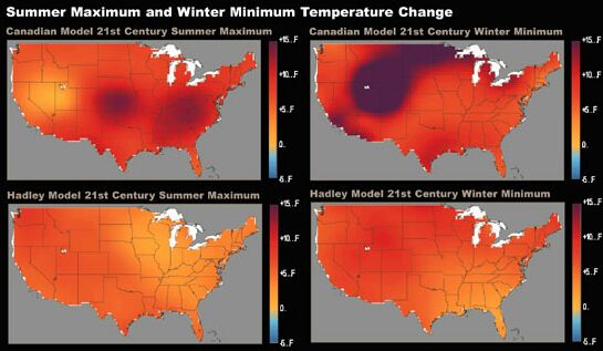
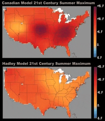
On the same
web page, there is another graph titled "Summer
Maximum and Winter Minimum Temperature Change" (shown
below), which contains the
USGCRP's final version of the Canadian and Hadley 21st Century
Summer and Winter Models, again with a choice of color scheme which blends
everything from 0° to 5° into a deceptive spread of orange. Even
areas which these models show will not change, are colored in orange.
What other purpose can this peculiar coloring scheme serve but to suggest
future warming
in areas where none is actually predicted by the model?
"The National Assessment of
the Potential Consequences of Climate Variability and Change" report
is comprised of three separate sections which represent themselves as
addressing increasing levels of detail. The descriptions are those used by the
USGCRP:
1.
Overview
Report: Concise, well illustrated summary.
2.
Foundation
Report: Volume, more detailed than the Overview Report.
3.
Background
Information: Learn more about the National Assessment.
The Overview
Report is published in both HTML and PDF formats and contains all of the
USGCRP graphs and most of the URLs, previously referenced. This report is
clearly intended for the media and the general public. Its primary message is
one of impending doom, associated with anthropogenic global warming.
I am not
sure why the USGCRP expended the effort to create the Foundation
Report. It has so many technical flaws, in terms of electronic publishing
techniques, that anyone who attempted to read it, would be quickly discouraged
from delving into its contents. The report is only published in two PDF
formats. Each subsection of the report is comprised of two PDF files, one which
is black and white, with extremely low resolution gray scale graphics. The
second PDF file contains the color figures and graphs but only the text
associated with each figure. As the figures associated with the text report are
all but useless, because of the poor quality, the serious reader must have two
PDF files open and switch between both files to comprehend the report. What is
interesting is that the PDF file titled "Potential
Consequences of Climate Variability and Change", which contained color
figures, shows in Figure 13, the US temperatures using the altered color
temperature scale, but in Figure 20, the Global temperatures are displayed
using the original color temperature scale found in the draft report. The only
function of the altered color temperature scale is to obscure the differences
between the Canadian and
Hadley models for the 21st Century United States. By contrast, the 21st Century Global graphs were not altered
in this way.
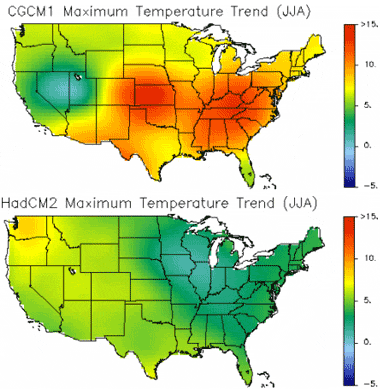
In the Background
Information section, things become interesting. On a deeply buried page at
"VEMAP
Trend Maps" the original high resolution images, on which the draft
graphics were based, can still be found. The individual graphs are: "CGCM1
Maximum Temperature Trend (JJA)" and "HadCM2
Maximum Temperature Trend (JJA)".
One could
engage in endless speculation as to why the USGCRP went to the trouble of
altering the first two sections yet failing to alter the third, which contained
the most incriminating information. The two most likely explanations are: (1)
the Background Information section was overlooked and (2) the USGCRP did not
expect anyone to find the original graphs from the Canadian and Hadley Models.
Also, on the "VEMAP
Trend Maps" page the Canadian and Hadley Models are not compared
side-by-side, so the inconsistencies between the models are not as obvious.
Of course,
the USGCRP may not even care if the real results from the Canadian and Hadley Models
are found. As long as the media continues to endlessly report only the results
from the first two sections, the voices of a few skeptics can be safely
ignored.
Last year in
another story, a
question was asked for which no reply has been forthcoming: If the evidence for global warming
is that compelling, why is it necessary for those who believe in global
warming, to misrepresent data in this manner to support their cause?
We are
still waiting for an answer!

Return to "Climate Change Guest Papers" page
Return to `Still Waiting For Greenhouse' main
page

FastCounter
by bCentral |

